Tuesday 1 April 2008

late late post lol

okayyyyyyyyyyyyy
so i spent too much time doing other peoples covers and neglecting my written work, but hey i got it done eventually, go me!

i actually did two front covers, one for my main magazine, and one special edition to show off my photoshop grooviness lol


=]
x sylvia

Sunday 30 March 2008


this was my first ever draft computerised.

* LATE c/w update*

i've had some errors accessing the blog, but finally have managed to log on and so i will now post some of my work.


MY ARTICLE:- Graffiti Culture.

Graffiti. A scribble on the wall? From the‘Jazz woz ere’ scrawled on the bus window with a cheap permanent marker to multicoloured murals with more than just a hard hitting message.

Graffiti has been described as a stain that plagues our urban environment, another social evil added to the ever growing list. Why are the views on graffiti so negative?Why is not regarded as the art form that some people believe it should be? To answer these questions we must really come to understand not just the mentality that a graffiti writer has, but also the culture that fuels such controversial activity.

Modern Graffiti has been disapproved and disregarded as an art since the "pioneering era" between the years 1969 – 1974.When writer ‘TAKI 183’ began to scrawl his tag name whilst on his travels as a foot messenger this sparked up media attention from the ‘New York Times’ in the form of an article called ‘TAKI 183' Spawns Pen Pals’ from this graffiti worked its way into the media and also onto the walls. By the time of the early 70’s to the early 80’s Graffiti had evolved from ‘TAKI 183’ commuting scribbles to a so called ‘epidemic’in

Df12231249jdfushnefn019j01nion01hji9n

New York city, or in other words the culture of graffiti was expanding and developing very quickly. With figures such as ‘Friendly Freddie’ who has been often credited for expanding graffiti and hip-hop music far past its Bronx roots, graffiti was finding new homes across the world. Cities seemed to be the hotspots for graffiti and by the time of the early 90’s almost every major city had many graffiti artist roaming the urban jungle and painting without rest, with the rising spread of graffiti it wasn’t long before the media again started to deem it in a negative way and so, naturally the general public adopted this negative view and so the variousstereotypes emerged about graffiti, it seemed as though the media was focusing on the petty vandalism that was labelled graffiti but in actual fact was nothing more than a thirteen year olds depiction of Sally down the road.

Many graffiti artists or writers feel that this is a unjust way in which they and their art work is viewed, I spoke to graffiti writer ‘Alpha’ who has been painting the London streets for 10 years, since the young age of fourteen. He told me ‘Graffiti has always been there for me, through the good times and the bad times, when I was young I found it hard to express myself, I was dyslexic and found myself finding it hard to put my feelings on to paper, the only way I seemed to be able to really show my true emotions was through art, but the sketches in my note pad weren’t enough, I wanted the world to know how I felt. It seemed as though if you wanted your message to be portrayed you needed to pay for it either with money or a court case, just because a message has been legally paid for and has been given permission to be placed there, doesn’t nessercerly mean that its giving out a good message, I remember reading a quote when I was around sixteen years old, it read "People with money can put up signs ... if you don't have money you're marginalized...you're not allowed to express yourself or to put up words or messages that you think other people should see. Camel (cigarettes), they're up all over the country and look at the message Camel is sending...they're just trying to keep the masses paralyzed so they can go about their business with little resistance." – Eskae’ this really gave me a insight into the deeper side of graffiti, the side that wasn’t just about ‘tagging’ and getting your name everywhere, it showed me the side that really wanted to portray a message, something meaning, something that when a person walks by it makes them think about the issue or topic displayed. I discovered I can have an effect on which the way people view and treat the world they live in’

Alpha was keen to explain to me the thin line in which people judge what is vandalism and what is graffiti, he told me that”people assume that because something is written without permission on a wall it is vandalism, but if it is done in the more ‘legal’ approach e.g. in gallery’s or legal wall’s people tend to appreciate the art of the graffiti, rather than the society’s concept on what is right or wrong”. It seems evident that graffiti is more than just writing on walls and more than just ‘vandalism’ it is a art form, a channel of unique expression understandable only by those that posses the ability think for themselves and have their own views of events of the world and are notcontrary to believe anything the media spews out of its perverted mouth. It seems as though the fact is that many believe it is wrong but to what extent are they willing to try and understand the concept behind graffiti, and really take in the message rather than reject it without any real attempt of understanding the hard work and thought that went into the graffiti displayed in front of their eye’s.

To help overcome this ignorant view, artists such as Banksy have emerged, they strive to help challenge people’s views of graffiti, his art has been portrayed as thought provoking and questions the lifestyles that people (especially in urban environments) live. His style is unique when compared to other graffiti artists, instead of painting ‘murals’ and spraying ‘pieces’ he produces stencils. These are in a sense frames of pictures that when sprayed leave a image (often very realistic looking) on the wall, he has manipulated these stencils to create his art and it makes them very unique in terms when in comparison to other ‘graffiti’ that is in London. One of his ‘pieces’ is of rats with humanistic characteristics, displaying the idea of the ‘Rat Race’, this and countless other examples of his work have created a kind of cult following and has managed to capture peoples inner feelings though his art. Banksy has also used his art to display his political opinion, which is not uncommon as this is what graffiti is often used for even if it’s not 100 colours and took countless hours of hard work.

Graffiti has had close links with music since the ‘pioneering era’ and beyond, just as music is a way of self-expression so is graffiti and so the two grew together becoming closely interlinked and having great influence on each other. UK hip-hip group ‘Task Force’ are closely linked with Graffiti and have made various songs about graffiti such as ‘Graf Da Bus Up’ and ‘Graforiginnes’ and are constantly making references to graffiti culture in their music, helping to positively reinforce the media stereotype of Graffiti and people’s attitudes towards it.

Graffiti is clearly about communication very human activity, and believe it or not has been vital in our understanding of history and also in the understanding of people’s ideas and political views. The first person living in the cave wrote on the walls to express him or herself, the Egyptians drew many pictures on their walls and thanks to this we know what we know today, without this ‘Graffiti’ our knowledge in such areas wouldn’t have been so complex and accurate. More importantly the idea of graffiti is still thriving today, this idea of self expression with no limits, no political correctness, just using the world as your notepad, displaying ideas and opinions that’s have not been perverted by power and by money but instead messages that come from the writers heart, a real depiction of human lifestyle in the era that the graffiti has been written in. The fact remains that for as long as man has a surface to write on, no matter how many cameras are put up, no matter how hefty the prison sentences or fines may be, there will always be the writing on the wall.

Written by Tom Gale


Thursday 27 March 2008

Finished Evaluation

Finally.


-

Product Account Summary

Brief: To research, plan and produce various elements of a new teen magazine aimed at either sex aged 16-19 years

When my group were given the brief the majority of us already had a solid vision of how we would like to see the magazine. So we divided the magazine industry into different genres of what we thought made up what type of magazines are sold and came up with a variety of different genres such as music, films and fashion. We found that these all came under the main category of ‘lifestyle magazines’, and found that these magazines are most dominant on the market. As a group we all already had a definitive idea on how we wanted our magazine to look and read and found that we had already come up with the premise of the magazine early on in post production. We all settled on the idea that our magazine covers were to be minimalist and appealing to the eye before we had done any market research because we all felt that we were all capable in the photography and image department based on a previous task set by our teacher also we all felt that magazines loaded with front cover content such as numerous headlines looked ‘cluttered’ and were far too common place and agreed the mode of address should be informal but at the same time intellectual.

When we started to do our research we wanted to gauge an idea of what magazines were and were not selling at the moment and to do this we used an ‘ABC Consumer Magazine Roundup’ website on the internet. From here we looked at the circulation figures of magazines from all aspects of the market from women’s monthly magazines to music magazines and analysed what were selling and what were not. To much of our disbelief we found that most of the magazines that we thought were doing well ,due to ignorance, such as the men’s lifestyle magazine ‘FHM’ were at a lost of 15.1% and failing to sell 56,114 than in their previous year. This how ever did not affect us as we had no intention of branching off into this type of magazine with the likes of ‘Zoo’ and ‘Nuts’ as due to recent findings, these magazines were at a loss and we all had our different views on what was wrong with these magazines whether it was their misogynistic nature or the lack of vocabulary. However as we were aiming our magazine more to teenagers we looked to the teenage magazine circulations and found they were all dominated by female magazines such as ‘Sugar’ and ‘Mizz’. After much more cross referencing and researching we had finally our set of ideologies as to what our magazine would abide by, it was to be; released monthly as to stand out as more of a collectible opposed to a disposable weekly that is forgotten about, it was to be aimed at males but still appeal to females as to not narrow our target audience and the whole premise of the magazine was to be ‘alternative’ in terms of music, fashion, films and culture as we felt there was a gap in the market for this. As a group we watched in class as our fellow magazine groups bustled around the class asking questionnaires as research for their magazines, we how ever chose not to do this as we thought they were unreliable, after all they were asking their opposition in terms of how their magazine should unfold. So we developed our idea to our liking with intent of getting feedback at a later time. This I feel was a vital decision that I feel helped us. We did have a idea that involved a viral marketing campaign via ‘Myspace’ that involved setting up a page for the magazine and taking feed back, we however decided against this as it would of taken just as long to set up a ‘Myspace’ and receive a substantial amount of feedback than it would creating the magazine.

The idea of our magazine being alternative comes from the lack of magazines like that out at the moment and we felt it went hand in hand with our focus on aesthetics. We do have 3 competitors though in the form of ‘Flux’, ‘Pop’ and ‘Dazed and Confused’. We stemmed many of our ideas from them as they are monthly and appeal to both sex. We also identified them as being alternative just by looks as the covers of ‘Dazed and Confused’ and ‘Flux’ portray an alternative look of magazine via the use of models on the covers as they stray from the normal cover model and all 3 of the magazines have a focus on image. We also found that these magazines all have a rather solid loyal fan base as well.

After analysing 3 covers 2 of which from our competitors we came up with a name for the magazine, originally we thought of ‘Trend’ but didn’t think it fitted, we then saw that the name was staring us in the face, ‘Alt.’, we liked this because it summed the magazine up and was small and easy to remember. We then split the magazine into 4 parts film, music, culture and fashion and each person in the group was given a category. I chose film as I feel it went well with my other as-level film studies. Also I already had an initial idea of ‘top 10 action films’ and an idea for a front cover. This however I changed later on as I thought that ‘action’ films was not too alternative and therefore not in touch with the magazine. So I came up with another idea for an article on cult films, I had dropped the ‘top 10’ idea as I felt it was too clichéd and I also asked my peers and they advised me to do that as well. I then came up with mock ups for my front cover and a first draft of my article and I exhibited them to my peers and drew feed back and acted on that opposed to a questionnaire at the start of production, this gave me more freedom to implement my own ideas and these ideas were well received any way in the form of mock ups that were exhibited.

Our first piece of production as a group was to come up with a style in which the mast head was going to take, we had decided on a style similar to that of ‘Pop’ in which the title also looks like a logo and is easily recognisable so we quickly found a suitable font in the form of ‘Billo’ and came up with this;

ALT*
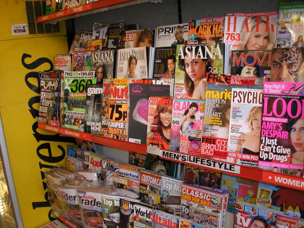
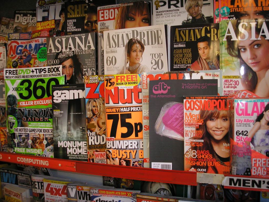
We liked this as we felt it was open to lots of different colour combinations to suit the different covers colour schemes, we also replaced the ‘.’ With a ‘*’ when we found it looked better, our peers agreed. From here we all took our verified mock ups and set off our separate ways and started taking photos for our double page spreads and front covers with the intention of getting them into Photoshop Elements on the Mac computers to manipulate the photos to our liking. Luckily in our group was some one highly skilled in this area who was a tremendous help in regards of this as she changed colours of existing images and changed the look of other photos such as making colour stand out more. We did have some problems along the way, one of the people in my group had completed his cover and in a flash Photoshop closed down unexpectedly and erased it as well as corrupting the data with in my plugged in USB which included a copy of my front cover. We were unable to recover the cover so had to start again. The front cover image that I used was one of a pink bar of soap in a rusty tray with the words ‘Cult Film’ written across it, I choose this as it is influenced by one of the cult films I wrote about; ‘Fight Club’ as there is a DVD cover of the film which has pink soap in a rusty tray with the words ‘Fight Club’ written over it. This was to add a touch of intertextuality and appeal to fans of the film and genre of cult films. We made sure that all our magazines looked the same as in the size of the mast head, barcode and strap line so they all looked like they were from the same company. All of our covers received positive reviews and to test the extent to which my magazine fits in and compares with other magazines on the market I printed off my cover, went to a shop and asked if I could put my magazine in the stand.


From this I found that my magazine does look professional enough to fit in with other magazines already on the market and I also noticed that it also stood out a bit more from the other magazines due to its ‘alternative’ looking nature. This I feel was essential as our main premise of the magazine was that it should stand out for being different to the norm and I feel we achieved that here. However I was told that the mast head may need to be bigger to attract more attention, so I resized I accordingly. For my double page spread I wrote the article on cult films and hosted it on our magazines blog and got feedback, the feedback was positive but I was luckily provided with constructive criticism to alter my article. So I did this in response and inline with my feedback. Also for photos to go in the double page spread I used my friends and a variety of costumes and props to recreate scenes from famous cult films such as the standoff between Mr White and Mr Pink in ‘Reservoir Dogs’. I then had the pictures put into a film strip with the intention of putting it on my double page spread. I made my double page spread using AppleWorks software, this I found rather frustrating as it lacked aspects that I am used to using Windows software such as a text box. This problem was over come as I eventually got to grips with the programme and was on my way to finishing my double page spread. As AppleWorks lacked text manipulation tools I used Photoshop Elements again to come up with a title. I drew inspiration from the double page spread I had analysed as I put all of my pictures in a row across the bottom of the page, I only covered one page however as to fit in the words. To match my front page I stuck with the pink and black colour scheme so the magazine has a sense of continuity. When I finished my double page spread I showed it and my front cover to my peers and asked for their opinions, the front cover was received very well, the only criticism being that the ‘cult films’ text on the soap was slightly faded and hard to read, never the less this was adjusted to the audiences liking. The double page spread was also liked, but it also had a criticism as it was ‘too text based’. This I feel was a valid criticism as it is heavily text based to look at, but when I dotted more pictures around I felt that they were out of place and disrupted the flow of the article. I used things such as the alt mast head font ‘billo’ as page numbers to keep a constant sense of branding throughout the double page spread, this was inspired by ‘Flux’ magazine.


As a teenage magazine that is aimed at an ‘alternative’ market I feel that ‘Alt.’ is effective in adhering to this as the issues addressed, such as ‘cult films’ are ones of alternative natures. Also the front cover images generated attention as people recognised the image from the film ‘Fight Club’ as intended. I feel that the audience feed back received for the magazine was very positive as one person even said; “id buy that”. One of the main reasons I think ‘Alt.’ went so well was due to us deciding we would do the magazine how we saw fit and then draw an audience response after. This was a risky move as in the end the audience may have not liked the magazine but in this case it paid off as it allowed us with more freedom. The influences of other magazines, mainly our competitors, helped the magazine through production as we had a specific set of ideologies as to what would be on our covers and what won’t. I feel strongly that ‘Alt.’ is successful as when we finished our production we were informed that a magazine had been released much like our ‘alternative’ one called ‘Wonderland’. This shows that as a group we were on the right track in terms of the concept of the magazine. Also the feedback the magazine received solidified my view of it being successful.

-


-Alex x

Wednesday 26 March 2008

Shop thing.

After media today i went into the other media room to make a proper start on my double page spread, it went a bit better than how it did last time as this time it actually allowed me to put photos on and move them around, however i am still finding AppleWorks to be a pain in the posterior to use. In terms of text manipulation Macs are not the best put it that way.
How ever i managed to fit in my whole article somehow, my film strip photo strip into the bottom of the second page and as i found it impossible to make a decent title using AppleWorks i took to photoshop and attempted one there, as i did not have Sylvia's help it was a bit harder than normal but i got the hang of it... eventually.
I downloaded a font off 'dafont' and then used a brush on photoshop to create a blood splattered effect and then after much annoyance and frustration i put it into my double page spread. From there my double page spread looks pretty good i think, however i just need to change the colour scheme of the whole thing to a more black and purple one to suit the cover, this should pose a few problems with my red and white title however. I will have to change the red 'blood' to purple and put it on a black back ground.

Any way after all that i went home and upon arrival grabbed my camera and went straight back out again as i realised i only had 2 days left till the deadline and i couldn't post pone it for much longer so i took my magazine cover that i print ed out and went to the shops near my road and politely asked them if i could put the cover in their magazine stands and take a photo to see what the finished product actually looks like compared to others on the market.

Volia;


Annnnnd...


Finally...


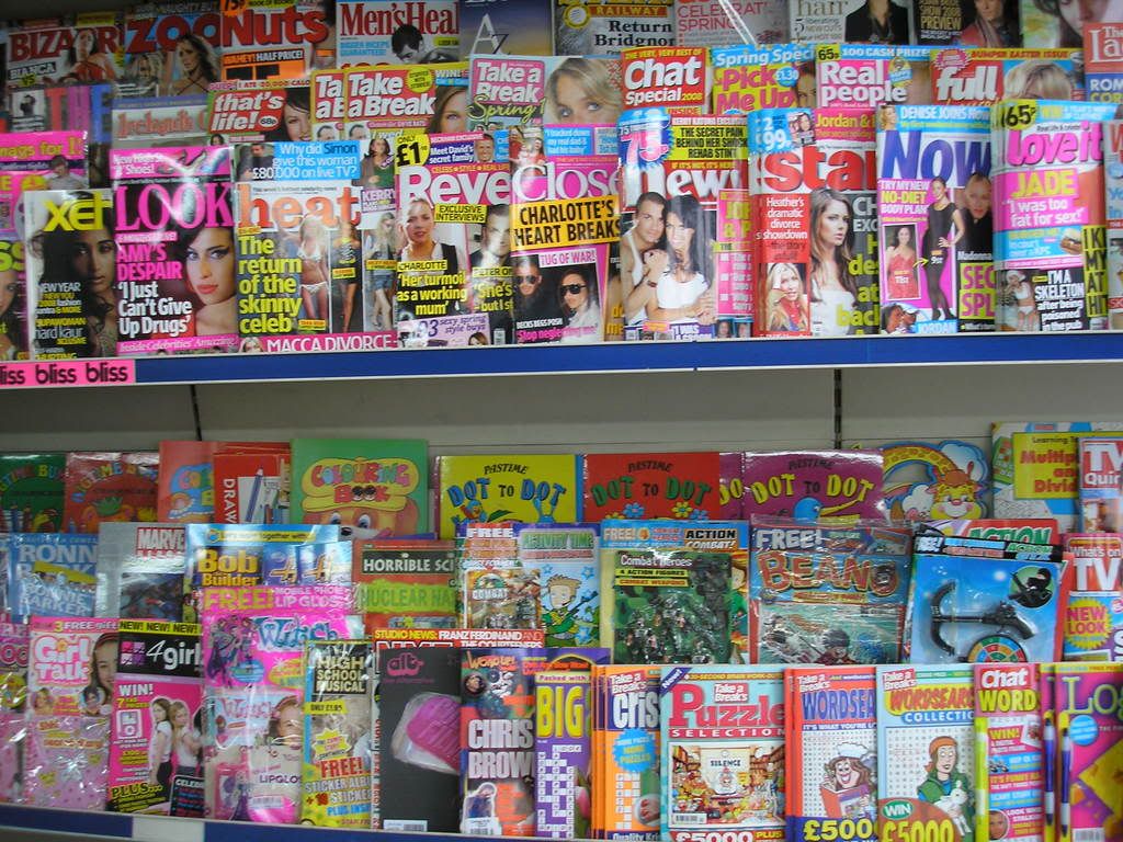
As you can see my cover seems to stand out a bit more than the others as it looks less 'glossy' than the others and also it is not a magazine, its just a sheet of paper and there is just the one of it. But i also got to thinking about how our magazines are 'alternative' and unique and how that generally means they should stand out more as they are more bolder and 'different' to the usual magazines up, which could in turn show that we were in fact successful in creating a magazine that stands out due to its alternative nature.

I say 'magazines' as plural because as a group 'Alt.' have completed all our magazine front covers and they would in fact be up on the blog if it were not for the Mac computers internet constantly dying on us. So hopefully in the not too distant future, they will all be up soon enough.

- Alex x

Tuesday 25 March 2008

My Article!!!!!!

I remember like it was yesterday, I was round my friend’s house one hot summer’s afternoon about two years ago playing dominos eating jerk chicken, rice and peas when his father put on his Ziggy Marley CD and played ‘Rainbow in the Sky’ whilst relaxing at the dinner table. From that day on I have been a huge fan of reggae music.
Obviously I had heard reggae music before but I had just never really taken any notice of it as I did not give it a chance. I suppose I had the common stereotypical view that Reggae music was for the target audience of Black, Afro-Caribbean’s so therefore never really took an interest in it. However this is far from the case as Reggae was very popular amongst white male skinheads during the 1980’s along with soul music, ska and rocksteady which are all genres of music of the black culture. Ironically it was even adopted by British Nationalist groups such as the National Front.
I find that reggae music is great to listen to when you are trying to relax and chill out, as the rhythm is usually slow and laid back. Other influences that have led me into listening to Reggae music are stars like Jimmy Cliff, Shaggy, Shabba Ranks and of course the legend himself Bob Marley who is one of the biggest musicians to ever live and the man who made Reggae music known worldwide, as when you think of the genre the first person to come to mind is Bob Marley. I am a huge fan of his as his music was very much about preaching and spreading a message through many of his songs, for example the song ‘One Drop’ and ‘The Redemption Song’ he sings about the slave trade which many cultures had suffered from in past history. Also in the song ‘One Love’ he sings about the need for world peace. Marley is a good role model for people to look up to as he expresses realism in his music. He does not talk about guns and sleeping with women, he does not give of a negative or fake message like many musicians do now days like 50 Cent. Marley spreads a good message and gets it across well which is why I am a huge admirer of him as a person and a musician. Another Reggae influence that I am a big fan of is Collie Buddz, who is famous for such songs like ‘Come Around’ and ‘Mamacita.’ Buddz is very unique as he is one of the only active white reggae stars around. From New Orleans in the United States; originally from Bermuda in the Caribbean, he is a rising star on the scene with a mix of Reggae and Dancehall.
Other types of reggae music include the Ska genre of music originated from Jamaica in the late fifties. Clashing calypso sounds with rhythm and blues. Ska was very high in popularity during the sixties which caused it to emerge on the scene in Britain. A good example of an English Ska band is Madness, who rose to fame in the nineteen seventies. Madness produced an amazing seventeen top ten hits in the UK charts which included such classics as Baggy Trousers, Our House and It Must Be Love. However it was not all joy as they were controversially linked with the skinhead subcultures that were thought of as racist.
Another popular white reggae band was Sting and The Police. Who were immensely popular in the late seventies to mid eighties. Songs such as ‘Don’t stand so close to me’ and ‘Roxanne’ shot them to stardom.
Carrying on the theme of stereotypes in music I was very surprised to find that many of my school colleges are big Michael Buble fans and have his latest album. Usually you would associate people in their late teens with R n B, Hip Hop and Grime music, artists such as Wiley, Snoop Dogg and Kanye West. However this is far from the case. This got me to thinking about whom else my fellow peers like to listen to. The list did not stop at Michael Buble as I found that many people enjoy the likes of Marvin Gaye, George Michael and Prince. I have been going around asking people there thoughts on music from other era’s such as the eighties, my good friend Arvind stated that he was a huge Lionel Richie fan, in fact he said “Lionel Richie is an amazing artist, his smooth voice and catchy tunes just make me want to get down, my favourite song of his is Dancing on the Ceiling.” Also as I was listening to a friends iPod and was very surprised when I found many eighties classics such as Phil Collins, Wham, Queen and Abba on there, however understandably this person would like to stay anonymous. I mainly listen to reggae, gangsta rap and club music. But do not let my rough and tough exterior fool you. When I have had a hard day at school or work I like to kick back and chill out to some Barry White and maybe some and I boldly state SOME George Michael tracks as they are easy to listen to and very relaxing.
So when adults say that the younger generation of today no nothing about proper music and only listen too boom box music is sadly mistaken. As most teenagers of today seem to have a wide variety range of music.

SKINHEAD: MUSIC AND LIFESTYLE
Reggae and Ska music were big influences on the skinheads. In fact many things in the skinhead followings were affected by the black culture, it does not stop at reggae music. As skinheads were deeply influenced by Jamaican rude boys, which was a term given to gangsters from poor slums in Kingston, Jamaica in 1960’s. Skinheads also copied the West Indies fashion. . Some may say that this is very hypocritical as many would not disagree that the skinhead cult is a ‘racist’ following. However skinheads themselves claimed to be far from this. Skinheads believed in standing up for England and its beliefs. When you think of a typical skinhead we are led to believe that they are violent, tattoo covered, Nazi, hooligans who fight all the time and want rid of all other races. In many parts of media skinheads are stereotyped of being racist but such films as ‘This is England’ give people a realistic look into the skinhead culture and what they are like. This film promotes skinheads as good people like me and you. However like a minority of people in all races and cultures we always get a few unsavoury characters that start trouble and give off a bad name to that group of people, this is what gives of a stereotypical view of skinheads that we see in the media.
Other music genres that Skinheads listened to are Punk Rock, people like The Clash and Glam Rock which you can see from the way some female skinheads dress as some are heavily drenched in make up.
Skinheads first came onto the scene in the 1960’s, working class people with shaved heads. In time the skinhead culture converted from a cult and gang in a way to a white nationalist, political group. Gangs of skinheads would start fights with Asians who they came across on the streets. Skinheads joined the National Front in the 1970’s. Which was the cause of an increase on race based crimes in the United Kingdom.

The traditional skinhead male would have a shaved head and maybe long sideburns. They would usually wear Ben Sherman style polo or casual chequered shirt or a plain white t-shirt. Levi’s jeans are very common wear with high turn ups. Along with Dr. Martens boots.
For female skinheads they would have shaved hair in some way usually allowing a fringe. As far as jackets and shirts their style is very similar to male skinheads. Short skirts are popular amongst the women and as for footwear they usually wore Dr. Marten’s boots as did the men.

Tattoos are very common in the skinhead culture. They are usually based on very patriotic symbols. Such as the British Bulldog and the national flag. Another very powerful tattoo in amongst skinheads is the spider web on the elbow. In the racist skinhead clans such symbols like the Nazi Swastika sign is very popular. Also a skinhead crucified on the cross, which is a powerful symbol and shows the importance and seriousness of the skinhead culture to some people as it states skinhead as a religion in some ways.

Sunday 23 March 2008

Evaluation- First Draft/bit

Started my evaluation today as i had nothing better to do but realised i could only do 2 thirds of it. well 1.5 thirds of it.

Shazam-

Product Account Summary

Brief: To research, plan and produce various elements of a new teen magazine aimed at either sex aged 16-19 years

When my group were given the brief the majority of us already had a solid vision of how we would like to see the magazine. So we divided the magazine industry into different genres of what we thought made up what type of magazines are sold and came up with a variety of different genres such as music, films and fashion. We found that these all came under the main category of ‘lifestyle magazines’, and found that these magazines are most dominant on the market. As a group we all already had a definitive idea on how we wanted our magazine to look and read and found that we had already come up with the premise of the magazine early on in post production. We all settled on the idea that our magazine covers were to be minimalist and appealing to the eye before we had done any market research because we all felt that we were all capable in the photography and image department based on a previous task set by our teacher also we all felt that magazines loaded with front cover content looked tacky and were far too common place and agreed the mode of address should be informal but at the same time intellectual.

When we started to do our research we wanted to gauge an idea of what magazines were and were not selling at the moment and to do this we used an ‘ABC Consumer Magazine Roundup’ website on the internet. From here we looked at the circulation figures of magazines from all aspects of the market from women’s monthly magazines to music magazines and analysed what were selling and what were not. To much of our disbelief we found that most of the magazines that we thought were doing well ,due to ignorance, such as the men’s lifestyle magazine ‘FHM’ were at a lost of 15.1% and failing to sell 56,114 than in their previous year. This how ever did not affect us as we had no intention of branching off into this type of magazine with the likes of ‘Zoo’ and ‘Nuts’ as due to recent findings, these magazines were at a loss and we all had our different views on what was wrong with these magazines whether it was their misogynistic nature or the lack of vocabulary. However as we were aiming our magazine more to teenagers we looked to the teenage magazine circulations and found they were all dominated by female magazines such as ‘Sugar’ and ‘Mizz’. After much more cross referencing and researching we had finally our set of ideologies as to what our magazine would abide by, it was to be; released monthly as to stand out as more of a collectible opposed to a disposable weekly that is forgotten about, it was to be aimed at males but still appeal to females as to not narrow our target audience and the whole premise of the magazine was to be ‘alternative’ in terms of music, fashion, films and culture as we had not come across another magazine like it. As a group we watched in class as our fellow magazine groups bustled around the class asking questionnaires as research for their magazines, we how ever chose not to do this as we thought they were unreliable, after all they were asking their opposition in terms of how their magazine should unfold. So we developed our idea to our liking with intent of getting feedback at a later time. This I feel was a vital decision that I feel helped us. We did have a idea that involved a viral marketing campaign via ‘Myspace’ that involved setting up a page for the magazine and taking feed back, we however decided against this as it would of taken just as long to set up a ‘Myspace’ and receive a substantial amount of feedback than it would creating the magazine.

The idea of our magazine being alternative comes from the lack of magazines like that out at the moment and we felt it went hand in hand with our focus on aesthetics. We do have 3 competitors though in the form of ‘Flux’, ‘Pop’ and ‘Dazed and Confused’. We stemmed many of our ideas from them as they are monthly and appeal to both sex. We also identified them as being alternative just by looks as the covers of ‘Dazed and Confused’ and ‘Flux’ portray an alternative look of magazine via the use of models on the covers as they stray from the normal cover model and all 3 of the magazines have a focus on image. We also found that these magazines all have a rather solid loyal fan base as well.

After analysing 3 covers 2 of which from our competitors we came up with a name for the magazine, originally we thought of ‘Trend’ but didn’t think it fitted, we then saw that the name was staring us in the face, ‘Alt.’, we liked this because it summed the magazine up and was small and easy to remember. We then split the magazine into 4 parts film, music, culture and fashion and each person in the group was given a category. I chose film as I feel it went hand in hand with my other as-level film studies. Also I already had an initial idea of ‘top 10 action films’ and an idea for a front cover. This however I changed later on as I thought that ‘action’ films was not too alternative and therefore not in touch with the magazine. So I came up with another I dear of an article on cult films, I had dropped the ‘top 10’ idea as I felt it was too clichéd and I also asked my peers and they advised me to do that as well. I then came up with mock ups for my front cover and a first draft of my article and I exhibited them to my peers and drew feed back and acted on that opposed to a questionnaire at the start of production, this gave me more freedom to implement my own ideas and these ideas were well received any way.

Our first piece of production as a group was to come up with a style in which the mast head was going to take, we had decided on a style similar to that of ‘Pop’ in which the title also looks like a logo and is easily recognisable so we quickly found a suitable font in the form of ‘Billo’ and came up with this;


ALT*

We liked this as we felt it was open to lots of different colour combinations to suit the different covers colour schemes, we also replaced the ‘.’ With a ‘*’ when we found it looked better, our peers agreed. From here we all took our verified mock ups and set off our separate ways and started taking photos for our double page spreads and front covers with the intention of getting them into Photoshop Elements on the Mac computers to manipulate the photos to our liking. Luckily in our group was some one highly skilled in this area who was a tremendous help in regards of this as she changed colours of existing images and changed the look of other photos such as making colour stand out more. We did have some problems along the way, on of the people in my group had completed his cover and in a flash Photoshop closed down unexpectedly and erased it as well as corrupting the data with in my plugged in USB which included a copy of my front cover. We were unable to recover the cover so had to start again.

-

-Alex x