-
Product Account Summary
Brief: To research, plan and produce various elements of a new teen magazine aimed at either sex aged 16-19 years
When my group were given the brief the majority of us already had a solid vision of how we would like to see the magazine. So we divided the magazine industry into different genres of what we thought made up what type of magazines are sold and came up with a variety of different genres such as music, films and fashion. We found that these all came under the main category of ‘lifestyle magazines’, and found that these magazines are most dominant on the market. As a group we all already had a definitive idea on how we wanted our magazine to look and read and found that we had already come up with the premise of the magazine early on in post production. We all settled on the idea that our magazine covers were to be minimalist and appealing to the eye before we had done any market research because we all felt that we were all capable in the photography and image department based on a previous task set by our teacher also we all felt that magazines loaded with front cover content such as numerous headlines looked ‘cluttered’ and were far too common place and agreed the mode of address should be informal but at the same time intellectual.
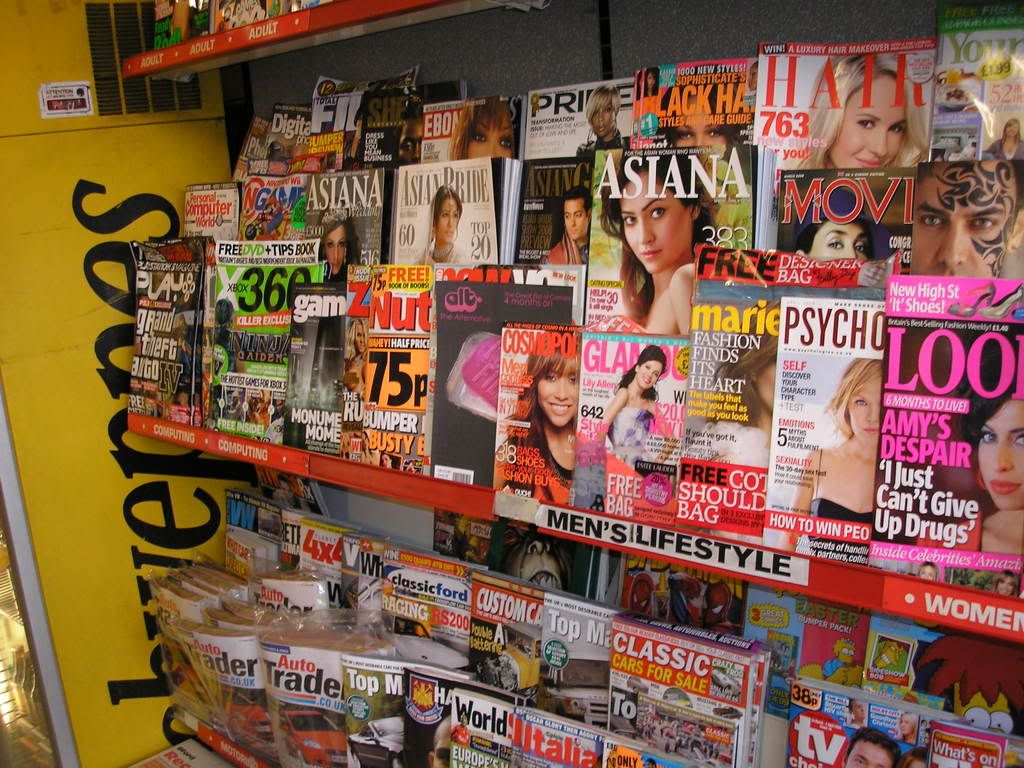
When we started to do our research we wanted to gauge an idea of what magazines were and were not selling at the moment and to do this we used an ‘ABC Consumer Magazine Roundup’ website on the internet. From here we looked at the circulation figures of magazines from all aspects of the market from women’s monthly magazines to music magazines and analysed what were selling and what were not. To much of our disbelief we found that most of the magazines that we thought were doing well ,due to ignorance, such as the men’s lifestyle magazine ‘FHM’ were at a lost of 15.1% and failing to sell 56,114 than in their previous year. This how ever did not affect us as we had no intention of branching off into this type of magazine with the likes of ‘Zoo’ and ‘Nuts’ as due to recent findings, these magazines were at a loss and we all had our different views on what was wrong with these magazines whether it was their misogynistic nature or the lack of vocabulary. However as we were aiming our magazine more to teenagers we looked to the teenage magazine circulations and found they were all dominated by female magazines such as ‘Sugar’ and ‘Mizz’. After much more cross referencing and researching we had finally our set of ideologies as to what our magazine would abide by, it was to be; released monthly as to stand out as more of a collectible opposed to a disposable weekly that is forgotten about, it was to be aimed at males but still appeal to females as to not narrow our target audience and the whole premise of the magazine was to be ‘alternative’ in terms of music, fashion, films and culture as we felt there was a gap in the market for this. As a group we watched in class as our fellow magazine groups bustled around the class asking questionnaires as research for their magazines, we how ever chose not to do this as we thought they were unreliable, after all they were asking their opposition in terms of how their magazine should unfold. So we developed our idea to our liking with intent of getting feedback at a later time. This I feel was a vital decision that I feel helped us. We did have a idea that involved a viral marketing campaign via ‘Myspace’ that involved setting up a page for the magazine and taking feed back, we however decided against this as it would of taken just as long to set up a ‘Myspace’ and receive a substantial amount of feedback than it would creating the magazine.
The idea of our magazine being alternative comes from the lack of magazines like that out at the moment and we felt it went hand in hand with our focus on aesthetics. We do have 3 competitors though in the form of ‘Flux’, ‘Pop’ and ‘Dazed and Confused’. We stemmed many of our ideas from them as they are monthly and appeal to both sex. We also identified them as being alternative just by looks as the covers of ‘Dazed and Confused’ and ‘Flux’ portray an alternative look of magazine via the use of models on the covers as they stray from the normal cover model and all 3 of the magazines have a focus on image. We also found that these magazines all have a rather solid loyal fan base as well.
After analysing 3 covers 2 of which from our competitors we came up with a name for the magazine, originally we thought of ‘Trend’ but didn’t think it fitted, we then saw that the name was staring us in the face, ‘Alt.’, we liked this because it summed the magazine up and was small and easy to remember. We then split the magazine into 4 parts film, music, culture and fashion and each person in the group was given a category. I chose film as I feel it went well with my other as-level film studies. Also I already had an initial idea of ‘top 10 action films’ and an idea for a front cover. This however I changed later on as I thought that ‘action’ films was not too alternative and therefore not in touch with the magazine. So I came up with another idea for an article on cult films, I had dropped the ‘top 10’ idea as I felt it was too clichéd and I also asked my peers and they advised me to do that as well. I then came up with mock ups for my front cover and a first draft of my article and I exhibited them to my peers and drew feed back and acted on that opposed to a questionnaire at the start of production, this gave me more freedom to implement my own ideas and these ideas were well received any way in the form of mock ups that were exhibited.
Our first piece of production as a group was to come up with a style in which the mast head was going to take, we had decided on a style similar to that of ‘Pop’ in which the title also looks like a logo and is easily recognisable so we quickly found a suitable font in the form of ‘Billo’ and came up with this;
ALT*
We liked this as we felt it was open to lots of different colour combinations to suit the different covers colour schemes, we also replaced the ‘.’ With a ‘*’ when we found it looked better, our peers agreed. From here we all took our verified mock ups and set off our separate ways and started taking photos for our double page spreads and front covers with the intention of getting them into Photoshop Elements on the Mac computers to manipulate the photos to our liking. Luckily in our group was some one highly skilled in this area who was a tremendous help in regards of this as she changed colours of existing images and changed the look of other photos such as making colour stand out more. We did have some problems along the way, one of the people in my group had completed his cover and in a flash Photoshop closed down unexpectedly and erased it as well as corrupting the data with in my plugged in USB which included a copy of my front cover. We were unable to recover the cover so had to start again. The front cover image that I used was one of a pink bar of soap in a rusty tray with the words ‘Cult Film’ written across it, I choose this as it is influenced by one of the cult films I wrote about; ‘Fight Club’ as there is a DVD cover of the film which has pink soap in a rusty tray with the words ‘Fight Club’ written over it. This was to add a touch of intertextuality and appeal to fans of the film and genre of cult films. We made sure that all our magazines looked the same as in the size of the mast head, barcode and strap line so they all looked like they were from the same company. All of our covers received positive reviews and to test the extent to which my magazine fits in and compares with other magazines on the market I printed off my cover, went to a shop and asked if I could put my magazine in the stand.
From this I found that my magazine does look professional enough to fit in with other magazines already on the market and I also noticed that it also stood out a bit more from the other magazines due to its ‘alternative’ looking nature. This I feel was essential as our main premise of the magazine was that it should stand out for being different to the norm and I feel we achieved that here. However I was told that the mast head may need to be bigger to attract more attention, so I resized I accordingly. For my double page spread I wrote the article on cult films and hosted it on our magazines blog and got feedback, the feedback was positive but I was luckily provided with constructive criticism to alter my article. So I did this in response and inline with my feedback. Also for photos to go in the double page spread I used my friends and a variety of costumes and props to recreate scenes from famous cult films such as the standoff between Mr White and Mr Pink in ‘Reservoir Dogs’. I then had the pictures put into a film strip with the intention of putting it on my double page spread. I made my double page spread using AppleWorks software, this I found rather frustrating as it lacked aspects that I am used to using Windows software such as a text box. This problem was over come as I eventually got to grips with the programme and was on my way to finishing my double page spread. As AppleWorks lacked text manipulation tools I used Photoshop Elements again to come up with a title. I drew inspiration from the double page spread I had analysed as I put all of my pictures in a row across the bottom of the page, I only covered one page however as to fit in the words. To match my front page I stuck with the pink and black colour scheme so the magazine has a sense of continuity. When I finished my double page spread I showed it and my front cover to my peers and asked for their opinions, the front cover was received very well, the only criticism being that the ‘cult films’ text on the soap was slightly faded and hard to read, never the less this was adjusted to the audiences liking. The double page spread was also liked, but it also had a criticism as it was ‘too text based’. This I feel was a valid criticism as it is heavily text based to look at, but when I dotted more pictures around I felt that they were out of place and disrupted the flow of the article. I used things such as the alt mast head font ‘billo’ as page numbers to keep a constant sense of branding throughout the double page spread, this was inspired by ‘Flux’ magazine.
As a teenage magazine that is aimed at an ‘alternative’ market I feel that ‘Alt.’ is effective in adhering to this as the issues addressed, such as ‘cult films’ are ones of alternative natures. Also the front cover images generated attention as people recognised the image from the film ‘Fight Club’ as intended. I feel that the audience feed back received for the magazine was very positive as one person even said; “id buy that”. One of the main reasons I think ‘Alt.’ went so well was due to us deciding we would do the magazine how we saw fit and then draw an audience response after. This was a risky move as in the end the audience may have not liked the magazine but in this case it paid off as it allowed us with more freedom. The influences of other magazines, mainly our competitors, helped the magazine through production as we had a specific set of ideologies as to what would be on our covers and what won’t. I feel strongly that ‘Alt.’ is successful as when we finished our production we were informed that a magazine had been released much like our ‘alternative’ one called ‘Wonderland’. This shows that as a group we were on the right track in terms of the concept of the magazine. Also the feedback the magazine received solidified my view of it being successful.
-
-Alex x
No comments:
Post a Comment